What this article covers
A typical flyover workflow has the following steps:
- Combine different data sets into a single table.
- Apply a plotting function to the columns of the table.
- Build a display to navigate the plots.
This vignette will introduce step 2: how
flyover’s plotting functions work and how to easily build
comparison plots for different types of data.
This vignette assumes you have a single data set composed of data from different groups for comparison. We will show how to use that data to build a collection of plots for comparing distributions between groups.
Data for this example
We simulate a data set with numeric and categorical variables from
two different sources (called “old” and “new”). Each source has a
slightly different data-generating process. Note the source
column where these values are stored. We wish to understand the
distributional differences of the other variables between these
sources.
str(my_data)## tibble [200 × 10] (S3: tbl_df/tbl/data.frame)
## $ source: chr [1:200] "old" "old" "old" "old" ...
## $ norm : num [1:200] 1.586 1.709 0.891 0.547 1.606 ...
## $ exp : num [1:200] 0.1772 0.0858 0.3273 0.5311 2.5615 ...
## $ chisq : num [1:200] 4.53 6.54 4.92 3.55 2.71 ...
## $ lnorm : num [1:200] 1.024 0.619 1.016 4.919 1.054 ...
## $ gamma : num [1:200] 0.866 0.89 0.549 1.02 0.948 ...
## $ alpha : chr [1:200] "c" "b" "a" "d" ...
## $ hilo : chr [1:200] "high" "low" "low" "low" ...
## $ tf : logi [1:200] TRUE FALSE TRUE TRUE FALSE TRUE ...
## $ fruit : chr [1:200] "pear" "pear" "apple" "pear" ...Built-in plotting functions
Plotting in flyover comes in two flavors, numeric and
categorical. The package comes with basic built-in plotting functions
that operate on columns of one of these types, and ignores columns of
the other type. This means you don’t have to pre-filter a data frame by
the type of data that the plots will use.
Numeric plotting functions will keep integer and float type variables and ignore everything else.
Categorical plotting functions will keep character, factor, and logical type variables and will ignore everything else.
Currently, flyover’s built-in functions and the data
types on which they act are:
| function_name | data_type |
|---|---|
| flyover_histogram | numeric |
| flyover_density | numeric |
| flyover_binline_ridges | numeric |
| flyover_density_ridges | numeric |
| flyover_bar_dodge | categorical |
| flyover_bar_fill | categorical |
| flyover_na_percent | both |
| flyover_na_count | both |
Plotting functions ending with _ridges are derived from
the package ggridges (documentation).
These are well suited to comparing numeric distributions through time,
e.g. for examining data drift across data pulls occurring on
regular intervals.
The functions titled flyover_na_* are for general data
quality monitoring and can operate on columns of both numeric
and categorical types. These are also best suited for monitoring data
through time.
See examples of monitoring data drift in this article.
Building plots
To build plots, you must specify at least three things:
- a data frame or similar object (such as a
tibbleordata.table) - the
flyoverplotting function you wish to use - the name of the variable that distinguishes groups (defaults to
flyover_id_which is the default output ofstack_data).
For each variable of the type associated with your chosen plotting
function, flyover will generate a plot. However, these
plots are not printed yet; they are merely stored in a tibble until they
are used to build displays.
Numeric plots
As an example, suppose we wish to compare the numeric variables in
our example data across the values of the group variable
source. We are interested in histograms. Then we would
build the plots in the following manner:
my_histograms <- build_plots(my_data, flyover_histogram, group_var = "source")
my_histograms
## # A tibble: 5 × 3
## variable plot cogs
## <chr> <named list> <named list>
## 1 norm <gg> <tibble [1 × 5]>
## 2 exp <gg> <tibble [1 × 5]>
## 3 chisq <gg> <tibble [1 × 5]>
## 4 lnorm <gg> <tibble [1 × 5]>
## 5 gamma <gg> <tibble [1 × 5]>Notice that the output is a tibble having column plot
which contains one plot for each numeric variable in the data. (See
below for a discussion on the cogs columns.) The function
does not print the plots directly at this stage. However, the individual
plots can still be accessed:
my_histograms$plot[[1]]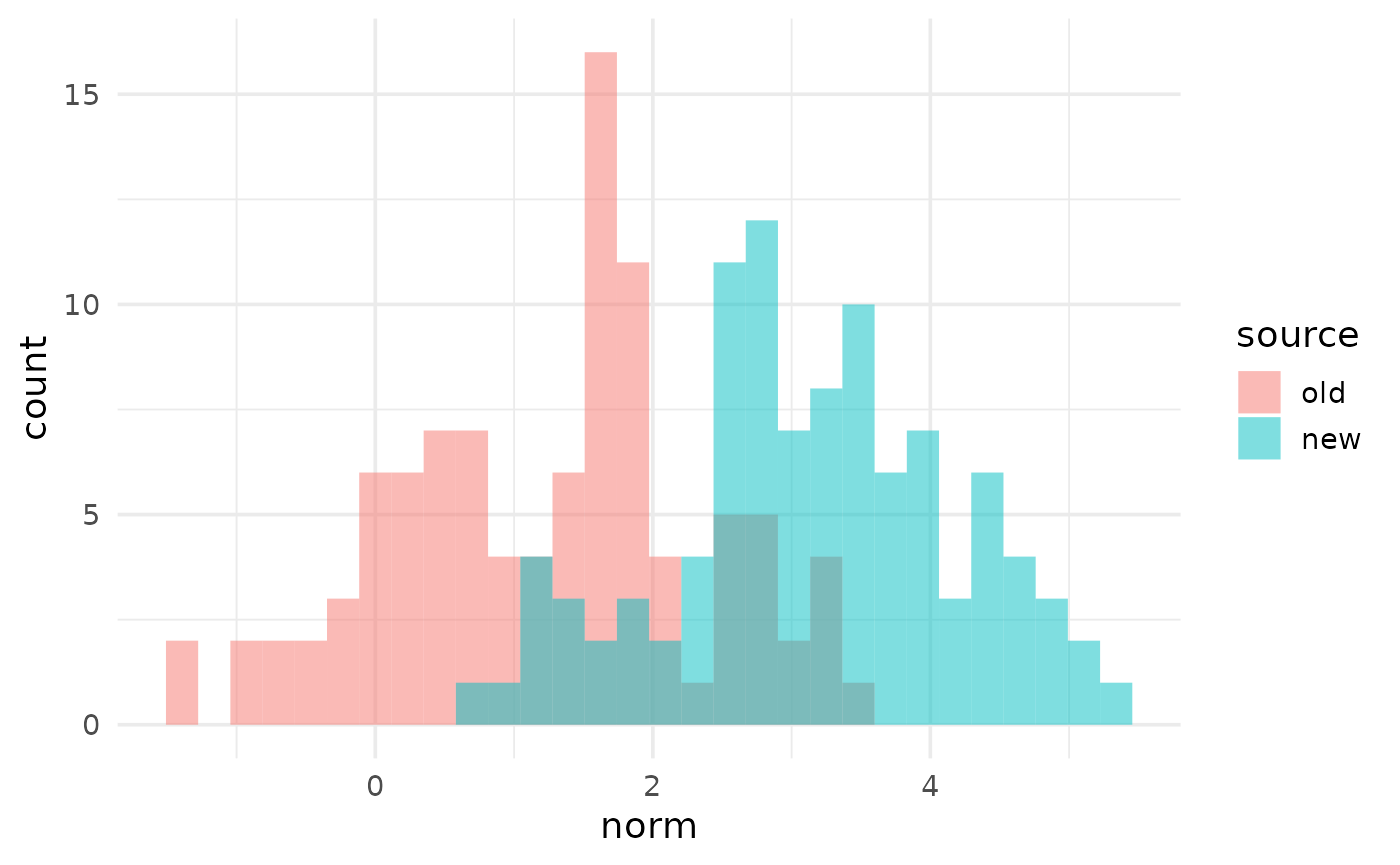
You are not limited to the default appearance of the built-in
plotting functions. You can modify these plots by passing additional
ggplot2 elements as a list:
my_histograms_mod <- build_plots(my_data, flyover_histogram, group_var = "source",
                                 plot_mods = list(xlab("new X-axis label"),
                                                  theme_classic(),
                                                  scale_fill_viridis_d()))

my_histograms_mod$plot[[1]]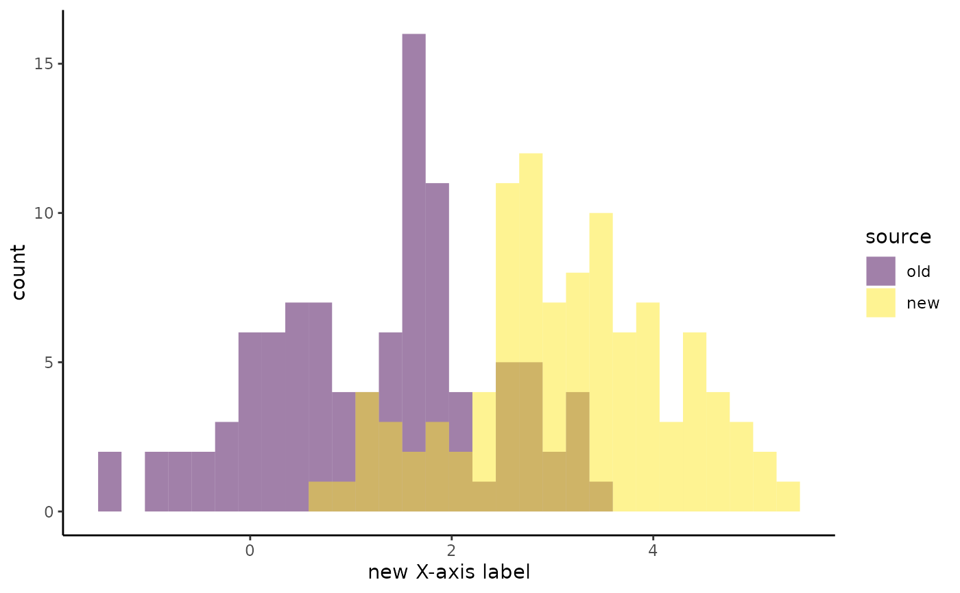
Categorical plots
In a similar way, we can compare distributions of categorical variables across groups by examining their proportions using bar plots.
my_bars <- build_plots(my_data, flyover_bar_fill, group_var = "source")
my_bars
## # A tibble: 4 × 3
## variable plot cogs
## <chr> <named list> <named list>
## 1 alpha <gg> <tibble [1 × 3]>
## 2 hilo <gg> <tibble [1 × 3]>
## 3 tf <gg> <tibble [1 × 3]>
## 4 fruit <gg> <tibble [1 × 3]>As before, you can view individual plots by calling them from this tibble.
my_bars$plot[[1]]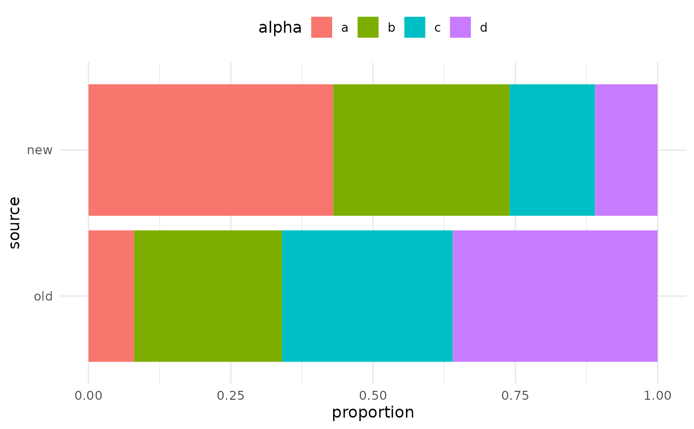
Cognostics
The tibble returned by build_plots contains a column
called cogs which is short for “cognostics”. You can read
more about cognostics in the trelliscopejs documentation.
In short, they are pieces of metadata that are associated with each plot
in order to sort and filter plots. They are stored as tibbles, and for
numeric plots they look like this:
str(my_histograms$cogs[[1]])## tibble [1 × 5] (S3: tbl_df/tbl/data.frame)
## $ pct_change_mean : num 152
## $ pct_change_median : num 111
## $ pct_change_max : num 53.9
## $ pct_change_min : num 147
## $ pct_change_n_missing: num 0These are summaries of features of the data used to generate the first plot. They represent the largest differences (in percentage terms) between any groups for that variable.
For categorical plots, the cognostics look like this:
str(my_bars$cogs[[1]])## tibble [1 × 3] (S3: tbl_df/tbl/data.frame)
## $ pct_change_n_missing : num 0
## $ pct_change_pct_missing: num 0
## $ n_levels : int 4The next article will clarify how cognostics are used in trelliscope displays.
Plotting in parallel
If you have an unruly number of variables to plot, you can save time
by creating them in parallel. On unix-like machines, you can supply an
integer to the ncores argument to render plots across
multiple cores. This uses the parallel package that ships
with R, which means that unfortunately this feature is not supported on
Windows (unless you are using Windows Subsystem for Linux).
For an introduction to parallel computing, see this chapter in Roger Peng’s book.
my_histograms <- build_plots(my_data, flyover_histogram, group_var = "source",
                             ncores = 4)
Using a pipe
Notice that these functions – indeed, all the functions in this package – are data-first, meaning they are pipe-friendly. Thus you could in theory write a pipeline like this:
my_histograms <-
  old %>%
  enlist_data(new, names = c("old data", "new data")) %>%
  stack_data() %>%
  build_plots(flyover_histogram)